UI library
With a User interface (UI) library we achieve a high design and development velocity, a higher product quality, and more predictable products for the user. Helping the user to develop trust in Priva and resulting in a quick learning curve for new Priva products.
Our UI library is the most practical implementation of the Design System. It contains two parts: code and design.
Code library
Development becomes fun when developers can benefit from a toolbox of code for styling, layout, page elements etcetera. When every development team builds upon work & knowledge from previous teams and doesn’t need to reinvent the wheel. It consists of two elements:
- A GIT packages and components library. While developing, our developers use, improve or add new packages and components. Storybook is used to browse the library;
- An ‘Appshell’ for all apps. It is an upgradable foundation with all our non-moving-parts.
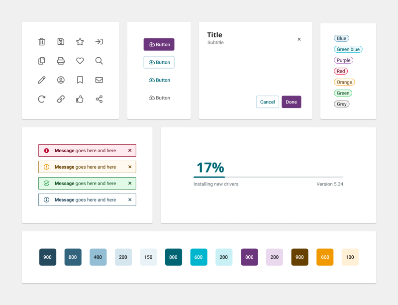
Design library
UX designers can focus on users & research instead of developers & design handoffs. Because of a library stacked with reusable building blocks (components, patterns, layouts) and best practices. Every designer builds upon work & knowledge from previous designers. It consists of two elements:
- a Figma library that matches the components of the UI code library. While designing the designer uses, updates or adds new components or patterns;
- a Terminology library for UI texts.
Vision
The UI Library:
- allows designers and developers to focus on the parts of the product that are unique and important.
- should always be helpful and empowering instead of being restrictive.
- aims to provide the right balance between consistency and flexibility.
- enables overall quality & consistency of the Priva product portfolio (which is always more important than the flexibility of one specific Priva product).
Style
Light - The light blue background color connects the Priva products with the brand while keeping the style light and easy on the eye.
Subtle & soft - A delicate rounding of the edges combined with subtle shadows & animations make the interface feel smooth and unobtrusive.
Colors - The usage of other colors besides blue is minimal and reserved for specific use-cases. This results in a functional & modest feel.
Contrast - Dark blue accent colors create a more powerful contrast that links the Priva products to the brand while giving it a professional look & feel.